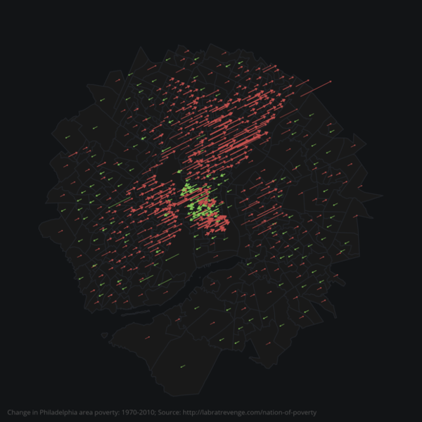
Over the past 40 years, most poor neighborhoods in the U.S. have only gotten poorer. Now, a series of new maps byJustin Palmer, a designer at Github, details exactly where these neighborhoods are—and just how much worse off they’ve gotten.
Each map tracks how the poverty rate in census tracts within 10 miles of a major U.S. city has changed between 1970 and 2010. Green arrows represent a decline in poverty; red arrows indicate an increase. Longer arrows show greater change, and thick arrows mean the area has a high population density.
While the results are mesmerizing, the maps tell a grim story about the persistence of concentrated poverty in America. Many of the maps show mere sprinkles of green arrows swimming in a sea of red ones.
[For more of this story, written by Linda Poon, go to http://www.citylab.com/housing...rican-cities/401219/]


Comments (0)