

U.S. migration patterns changed plenty from 1850 to 2013. Anifty interactive map, created by the Pew Research Center, visualizes these shifts by showing the origin of the dominant immigrant group in each state for every decade during this time period.
The map is a part of a comprehensive report on past and future immigration trends, the main point of which is to highlight the impact of the Immigration Act of 1965. But the map reveals the events, policies, and trends before and after 1965 that shaped the waves of U.S. immigration.
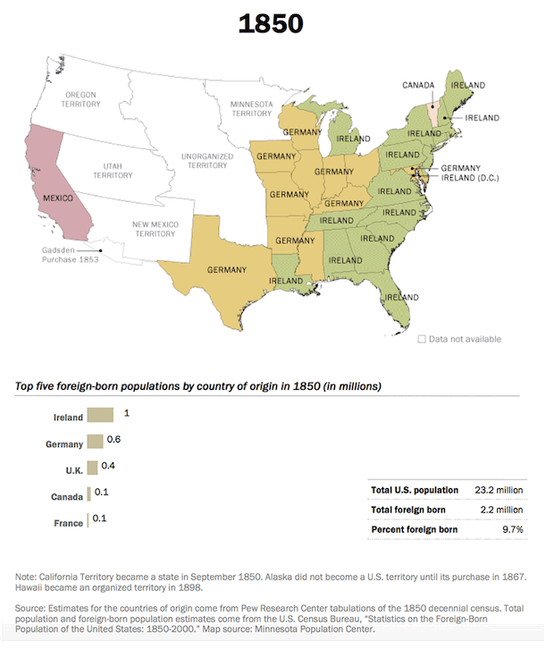
From 1850 to 1880, for example, Irish immigrants were the largest group of new arrivals, closely followed by Germans. The Irish potato famine and crop failures in Germany, and later war and political destabilization in Europe, are all partly responsible for pushing out these and other migrants out of Europe and into America—well into the 20th century.
[For more of this story, written by Tanvi Misra, go to http://www.citylab.com/work/20...ts-came-from/408223/]
Comments (0)